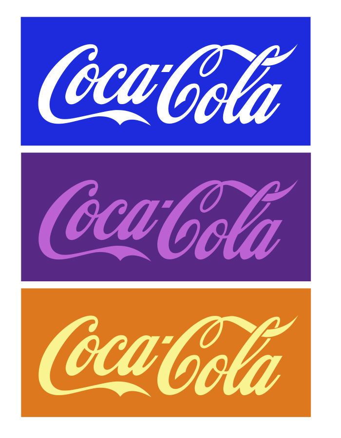
Could you imagine the Coca-Cola logo without its iconic red? How about a purple and orange Subway logo? Color theory plays such an important topic in branding and marketing, yet you may not know the specific psychology behind the colors you are drawn to.
When creating a new logo, you come to the design table with certain goals in mind. What is often overlooked is the tremendously important role your color palette plays in your brand perception. Whether considering a rebrand or working on new marketing collateral (whether visual or text content), allow this graphic designer to briefly pull you into the world of “color psychology”.
Color psychology is the notion that certain hues influence perceptions that may not be obvious. Certain colors evoke certain emotions and create certain judgements about your branding right off the bat.
Do Colors Speak Louder Than Words?
Blue: Blue is by far one of the most common colors used in logo design, but that is no reason to shy away from it! Blue overwhelmingly creates a feeling of trust, security, and reliability. It is perceived as genuine, down-to-earth, and trustworthy, making blue a top choice for tech companies and financial institutions. Blue is a dependable friend that always stands by your side.


Multi-Colored: Most brands have one or two main colors in their logo and secondary colors to use in their collateral. Some brands, however, want to evoke a childlike sense of fun and use a rainbow of colors in their main branding. Multicoloured logos have also come to represent internet-related technology like apps, browsers, networks, or operating systems.

The way our brain makes instant judgements about a brand based on its main colors is fascinating and important to consider.When designing our own logo, Interprose intentionally chose a purple hue. Purple is often associated with royalty and regalness and in branding often evokes feelings of sophistication, authenticity, and luxury. A purple palette helps convey a sense of honesty, wisdom, and quality.

Think about what you want your logo to say to the world upon initial glance and it may help you to narrow down your palette. And if you need professional help, well, the Interprose design team would be happy to explore rebranding with you.
This post was first published by Rachel DeFrank on Interprose’s blog, Interprose Voice.